top of page

THUNDER COLLEGE
AMBASSADOR
This visual campaign was created to promote the THunder College Ambassador Program, which invites students passionate about sports marketing, digital content creation, and brand storytelling to apply.


THUNDER YOUTH BASKETBALL CAMPS
For the Thunder Youth Basketball Winter Camps, I designed a seasonal look that felt energetic and on-brand. I used a cool blue gradient background to evoke a winter feel while staying within the Thunder’s color palette. The playbook-inspired pattern, pulled from the official brand guidelines, adds subtle texture and reinforces the basketball theme without overpowering the design.


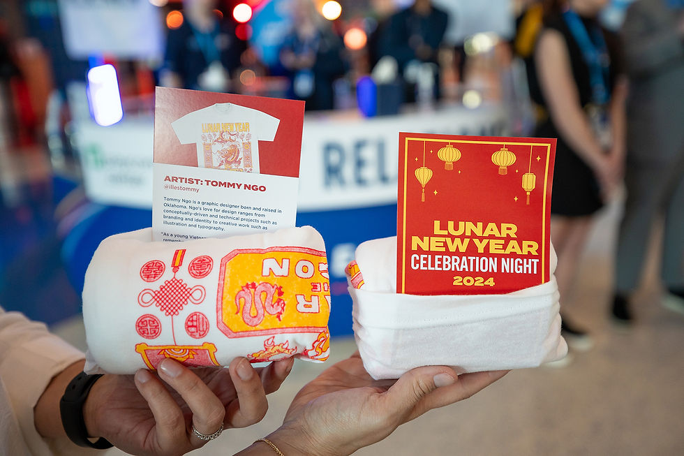
LUNAR NEW YEAR
In celebration of the Lunar New Year, I led the visual branding for the Lunar New Year Celebration Game sponsored by the Asian Chamber of Commerce. The Chamber requested the exclusive use of red and gold, colors symbolizing prosperity, joy, and good fortune in many Asian cultures.
To enhance the design and give it more depth, I decided to incorporate subtle traditional patterns inspired by Asian decor. These patterns added texture, cultural richness, and visual interest.

.jpg)


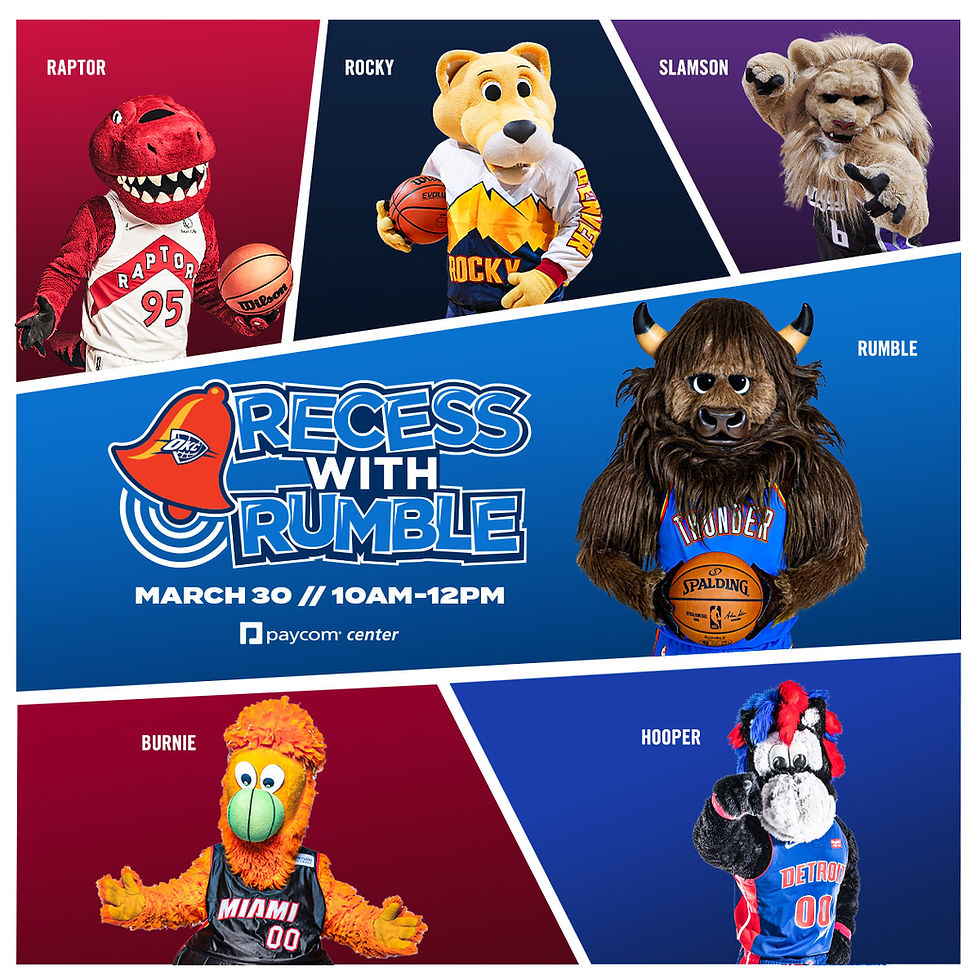
RECESS WITH RUMBLE
For the Recess with Rumble event, I designed the graphic to feel playful, energetic, and kid-friendly, aligning with the spirit of the event—giving young fans a chance to meet NBA mascots up close. I used bright, saturated colors and bold geometric shapes to create a dynamic layout that feels fun and engaging, while still staying true to the Thunder’s brand.
.jpg)
HBCU NIGHT
I designed the custom "HBCU Night" wordmark to be strong and modern, reflecting both pride and celebration. The
wide-set, all-caps typography communicates unity and importance, while the block-style letterforms offer a collegiate feel that subtly nods to traditional HBCU aesthetics.
I chose a dark gradient background, shifting from deep navy to black, to create a sense of depth and sophistication while maintaining visual consistency with the Thunder’s brand aesthetic. The gradient adds subtle visual interest without overpowering the core content, allowing the bright blues and white elements, especially the HBCU Night type treatment, to stand out with clarity and impact. This contrast helps guide the viewer’s eye and reinforces the bold, high-energy
feel of the event.
THUNDER
PROMOTIONAL DESIGNS
During my time with the Thunder, I led and created a wide range of marketing campaigns from the ground up, taking full ownership of each initiative. I developed strategies that aligned with Thunder's brand guidelines while tailoring them to meet the unique objectives of every event. By carefully balancing brand consistency with the specific goals of each campaign, I designed impactful marketing materials that effectively resonated with target audiences and boosted engagement. This hands-on experience enhanced my expertise in brand management and honed my skills in event-driven marketing.
bottom of page